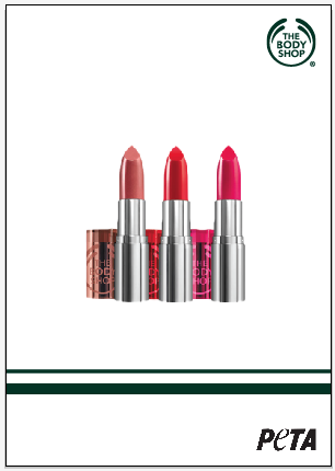
Here is the four products and there descriptions.
With these products I would like to take these adverts back to what the body shop use to represent. I want to take it back to being simply and basic but also let it be focused solely on the product itself. I think this will get people to focus on the brand a lot more if they were more focused on the products than money.
To get some idea's I wanted to get straight into the designing part of this brief.
These two images are a a rough design that I had, I remember that the body shop is green and that I'v seen this used a lot in the company simply because this is there brand colours. This has made me think that you don't really see this as much any more you don't see the dark green on posters or even on the website, this is way I chose this particular colour.
Here I used the same design as before but for all the products, I think this is a strong look for the body shop. It's basic and shows of the product well and doesn't have anything unnecessary on the poster.
I choose to here have the logo and the peta logo in the corners so that it was more focused on the product however this could change?
With this design I went for the complete opposite to my previous design, I wanted to experiment with the green colour and to see how well it would look with it coming off the page like this. I think this design simple however it does feel like the product has a border that cuts off the other two logos.
Here I again tried out the similar idea to the previous design I just wanted to play around with the line colours. This design looks and feels better than the previous design it feels like it fits the page better.
Here you can see I again did a similar thing with the lines, I do really like this idea as its simple and modern I can also see that it would work in stores. However maybe this idea has stepped away from my original idea where I wanted to take the body shop back to basics and to what they used to be like? I maybe should look at my first idea with the green background? Maybe play around with the layout and size?
With the basic design I played around with the logo so it's seen more than the very first design where the logo was just in the top corner. I like the fact its bigger and more central in the poster but I think it should maybe be a different colour such as white? It might change my idea on this design because the logo seems to be hidden by the green background. I think the peta logo should be the same in white to as this will contrast better with the green.
With these designs I think the slogan "Save their skins" should be used as its a bit more effective and I like the idea of this being at the bottom of the advert to keep the product basic.
Here I moved the design on I chose to have the logos in white simply because it worked a lot better than the black however it also takes it back to what the brand use to look like outside the shop white on green. It just gives it the identity back. I like the idea of the logo being a lot bigger and more in the eye of customers than just being in the top corner of the poster.
Here is where is what I remember the body shop looking like.
Here I again wanted the focus on the logo and the brand name instead of the product. This is way i have positioned the logo more central, I think the next development is to have the image positioned differently on the page instead of here maybe?
This design is a lot more different and doesn't really show the product as much simply because many people or people who shop there know what the products are however they need to remember the brand which I think this design does.
I think the slogan for the products can be positioned well either above the logo or mirroring the logo.
Now that I have a design that I like and are happy to move on with I have decided to move onto the extra words on the poster.
I wanted to see what the words would look like on the top of the poster, this I don't think works as its just a bit to simply and to plain for the poster. I don't think it actually works with the rest of the poster, I think I need to try have the words around the edge somehow?
I tried the idea of the words around the edge, i tried out different positions on the logo, the best out of the designs is the last image simply because it just works with the logo. I think it finishes it off nicely and the way you read the poster it just fits.
I need to try out the typography for the poster.
You can see that I tried different plain typography I chose optima as it was a good contrast to the logo and was easy to read.
With the typography chosen I tied it out on the poster with the different ways i.e. bold italic, I realised the italic doesn't work as well simply because when you look at the poster it reads strange overall it didn't work well.
I like the last image from above, I tried the regular Optima font and I think it doesn't overpower the rest of the poster as much as the bold font which I like. I just need to reposition it a bit higher of the logo so there is a bit of green to separate the logo from the words. It will ultimately read better.
Here is the changes.
Here I made the changes to the other products, i think this has worked really well for this design as it's concentrating on on the brand then the product then peta campaign. I also have decided that the green has worked really well for the design as before i wasn't to sure if the full colour worked however i'm glad I went back to the design.
The postions are quite central as I have perviously tried an off centre design but I didn't think it concentrated on the brand it was very product orientated, they also remind me of existing adverts for the brand.
Here you can see that I have updated the words at the top of the body shop logo to fit the different products, I have carried on worth the capital theme as it works with the design.
Here I have changed the 'save their skins' typeface to Century gothic to keep the theme going and to finish the design off.
Peta Campaign poster
For this poster I chose the line 'save their skins' for the main body shop posters however for the main poster I like the idea of using 'saving your own skin why not save theirs' as its a bit more explanatory to the viewers?
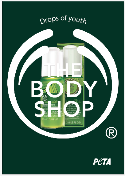
Here I did a basic design for the peta campaign that is basically based off the body shop design as I think this is a nice link to the adverts. I think the green background works well for the adverts like I said before it takes the look back to what it used to be. With this design I used the 'saving your own skin why not save theirs' as a good strong strap line for the campaign, I don't think much is really needed such as an image as a lot of people know what peta is as its become more worldwide.
I chose to have the body shop in the corner like how peta was just because its an easy simple way along with the colour to link the two brand names.
I think the next step will be to look at the typography for these parts as I think they can look softer.
Out of these typefaces, I think Century Gothic was the best chose as it was a lot nicer to read and is a very nice type to read as well. It's not to harsh on your eye.
I have chose to have the type in italic as it acts like a quote from each brand, I also think its a good contrast between both typefaces. I do like the way the logo for peta is on a slant which is a good contrast.
Here I wanted to develop my design a bit more and have fur included in the design to bring peta through the body shop brand. I have looked at peta adverts before and some of them are a bit hard hitting and this isn't what I want for this brand at all. I firstly simply just took an image and played around with the position the second image works nicely as it breaks up the green background like the fur is breaking free.
To move this idea on further I chose to see how the peta logo would look with the fur being in the background of the logo. This idea has worked really well and I like how the effect has worked with the rest of the poster.
Here I moved the idea on even more to show other fur's or skin's that people want as luxury or chose to wear. The snake skin and giraffe print has worked really well and looks very exotic with the green background. I think this is an interesting twist to my simple design.
After leaving the brief for a while after coming back to the design for the campaign I decided this didn't work as well as I wanted it to and didn't really fit in with the rest of the posters for the products. I think I need to have a more of a focus on the words rather than the logo as this isn't as important to what the campaign is about.
After rethinking the design I chose to use 'Save their skins' rather than 'Saving your skin why not save theirs' both are strong and put what the campaign is about on the poster. However I think 'Save their skins' gets straight to the point and is a lot stronger to the passing public that will read the poster.
With the designs i wanted to try out some ideas that I had with size and position, with these design's I like the idea of having the text in the middle of the poster as it just seemed to work and fit better.


With the further development I looked back to my product posters and I like how I have chosen to have the product in the background and the logo in the front to focus more on the brand as this is the main priority. This idea I thought would work for the peta campaign poster, from the last lot of designs I decided to have the text at 200pt as I thought this was big enough however with these designs I went a lot bigger to 300pt/305pt to see how this would change the appearance of the text. With the design's I'm glad I have done this as it's given the text more of a voice on the poster and works better with the two logo's at the bottom. The logos are as equally as important as the words but I wanted the poster concentrate more on the words. I chose to carry the body shop logo onto this design as I thought this was a nice way to keep the posters linked so having the body shop as the product and peta the brand. This is just a simple but effective idea that I think works really well for the brand.
Again with the typography i changed the distance between the words to be more like the body shop and I have been going from the two designs with and without capitals at the beginning of 'their' and 'skins'. As in a way I think they both work well, however I want the words to say something not to shout out to the public like with the capitals does.
I tried to position the words as best as I could in the centre of the logo, the next bit of design that I'm thiking of is if the body shop logo needs to been seen twice? In a way i think it does as it's an important part of advertising the brand so this is way at the moment I have chosen to keep it even though it does look good without it but it feels like something is missing from the poster.
Here I again went back the body shop logo in the corner as I think this is still important to have I thought about having the logo a bit smaller than it original was? To see if it still looks good and as effective. However I still go back to the first design as it makes both brands equal.
Here I tried out all the posters together to show them as a series, I think they all link well and show that I'm trying to promote the brand as well as the product as I think this has gotten lost in the brand now. However just by looking at these together I need to change the position of the logo in the background to be in the same the position as it's off a little bit.
Now the changes have been made I do like how they all flow as a campaign. They work well as a series, even though i'm still not sure on the size of the body shop at the bottom??
After doing some thinking I decided to go with this design as it works really well and just fits in better with the other designs.
As a last part of development work to my A2 posters I have made a qr code that people with smart phones can use to go straight to the body shop website and go straight to the peta page. This is a nice simple way that people can go get information quickly just by taking a picture.
This here is the bar code that I have designed to go straight to the body shop website, this will be placed on the posters in the same sort of way as the logos have to keep the theme going.
Here you can see how the codes have been laced on the poster, I wanted to go with the same sort of theme as the rest of the poster. By keeping the code white to keep things the same as the logos etc, I also kept the code next to the peta logo as this is way to show the public that this is what the code is going to explain. I didn't want to make the code big or smaller as people might not see and it wouldn't fit in with the rest of the poster.
On the campaign poster I chose to have the code the same size as the body shop and the peta logo as I feel they are all of the same importance and just looking at the image it works really well.
Here are all the posters together, I am very proud of this and you can see they all work for the same campaign and I think this bring back the old body shop where its focusing in the logo and the colour green which isn't really focused on really anymore.